UMass Boston biology professor develops interactive website analyzing COVID-19 data
Site allows visitors to use CDC data to explore trends, hypotheses
During the coronavirus pandemic that has forced many people to rethink how they use their forced time at home during social distancing and quarantines, UMass Boston Associate Professor of Biology Liam Revell decided to take on a new project: develop a website that enables users to interact with COVID-19 data over time and visibly see trends with dynamic graphics.
“I’m a computational biologist, but I work mostly on evolutionary tools with evolutionary data,” says Revell. “Just out of my own personal interest, I started to pull down some of the publicly available data from the CDC and began doing some analyses. The first analyses I started with were looking at excess mortality.”
By excess mortality, Revell means—as charts on his site show—the number of deaths during the coronavirus pandemic compared with deaths over previous year. As would be expected, the excess mortality rate peaks with the generally acknowledged trends of COVID-19 deaths, but his site enables users to drill down to see rates among particular age groups.
“My interest stemmed initially from looking at this by age because COVID-19 is a disease that causes particularly serious complications among older people, so I wanted to look at excess mortality in different age groups,” says Revell, who notes frequently seeing news stories about younger people dying from the disease. “So that’s what I designed the interface to do because I hadn’t seen anything like that that was available and easy to interact with.”

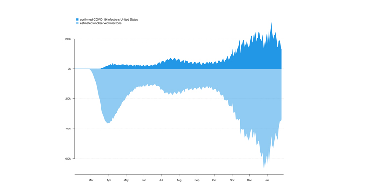
The multifunctional website project explores COVID-19 infections and deaths through time, among states, and by sex and age. The platform, according to Revell, uses a relatively simple model to estimate the true number of infections (rather than simply observed cases) through time, and the results it yields are highly consistent with estimates from prominent research centers, such as the Institute for Health Metrics and Evaluation at the University of Washington.
“It is critical that we gain knowledge about this wicked pandemic so that we are better equipped to fight its deadly reach,” says UMass Boston Chancellor Marcelo Suárez-Orozco. “I thank and commend Dr. Revell for his work to further illuminate data of this disease.”
“This type of data analysis is one part of the equation,” Revell says. “The other thing is just visualizing data—seeing precisely what the data show by age, state, geographic region, and so forth.”
For example, bar charts showing weekly deaths compared with average deaths the previous year vary greatly as a user selects different age groups—showing almost no excess deaths in the under 25 age group but significant excess deaths starting with the 45-64 age group. And while other research models will provide similar data, Revell emphasizes the interactive component of his computational model.
“One difference is that in those models the research team decides how the model is programmed. What this model allows you to do is to say, ‘Well, I have a hypothesis about how the infection fatality rate (the proportion of deaths among all those infected) has changed over time so I am going to set this hypothesis using these dates and ages groups.’ I’ve never seen something that does precisely this,” he says. “It also creates what I feel are fairly compelling data and model visualizations I haven't seen represented in the same way in either primary scientific or popular press literatures.”
Revell frequently develops computational tools with grant support from the National Science Foundation, but this project is not externally funded.
For more information, visit U.S. COVID-19 Explorer (covid19-explorer.org).