UMass Amherst students, staff collaborate to make equity-minded analytics easily accessible
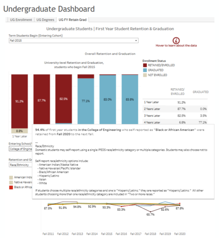
A yearlong collaboration between student activists and University of Massachusetts Amherst administration has led to the launch of easily accessible equity-minded and graphics-rich data dashboards about the enrollment and retention of students of color. The new dashboards are designed to quickly and easily provide information about students, including those who identify as BIPOC (Black, Indigenous and People of Color), says Barb Chalfonte, executive director of strategic analytics.
 The collaboration came after student groups such as UMass for Black Lives and Racial Justice Coalition formed in the wake of national outrage over fatal police confrontations with men and women of color, including the murder of George Floyd in May 2020.
“I know that there were other Black students within my program were noticing a lack of response on the programmatic, departmental, and general university side towards the atrocities that were happening across the country,” says Wayne Barnaby, founder of UMass for Black Lives and fifth-year doctoral student in neuroscience and behavior. He and others were also frustrated by the lack of information about black students available online and how it was presented, he says.
UMass for Black Lives joined forces with the Racial Justice Coalition to present the university with “a list of demands and suggestions on how the university itself could better support black students and students of color,” Barnaby says. One recommendation was to provide information on recruitment and retention of students of color in an easily accessible way.
 Much of the information was available, but “you had to already know your way around the data in order to make use of what was there,” Chalfonte says. “That’s what Wayne and his colleagues encountered. We heard their frustration about trying to find the data that validates their lived experience.”
At the provost’s request, UAIR guided a working group including graduate and undergraduate students, faculty and staff to redesign the way information was presented on the UAIR website.
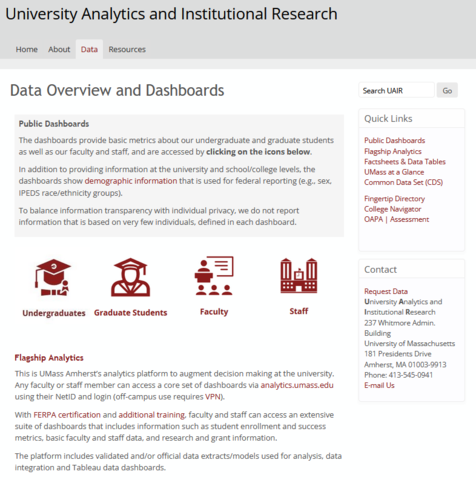
“In the past, data has been organized into categories like admissions, retention and enrollment,” instead of those more familiar to the public, such as undergraduates, graduates, faculty and staff, Chalfonte says. “You have to know how universities work for that to make sense.”
Now the information is available in more familiar categories and guidance is provided when a cursor hovers over a selection.
“It’s all up-to-date, fall 2021 data,” that’s available, Chalfonte says. Popular data points –such as how many students are at the university currently — are presented in an easy-to-understand infographic form.
“Now, with the ability for the black community, and for student communities, to monitor these demographics, it allows for the opportunity for these voices to speak confidently to the administration about what’s actually happening on their campus,” Barnaby says. “But it must be met by an administration that is willing to listen and act on the concerns of these communities.”
The development process also led to discussions about the delicate balance between transparency and privacy, and why some information that can potentially expose individual identities needs to be shielded from public view.
 “Maybe for enrollment they could see the number of black students in the College of Natural Sciences, but in another analysis, they could only see underrepresented minorities because the number was so small it had been rolled up into an aggregate group,” Chalfonte says. “In the new dashboards, we address privacy in a way that preserves the demographic groupings.”
In partnership with The Stonewall Center and other units, UAIR is also developing a way to report gender identity data based on how students self-identify, rather than restricting options to male or female.
The next challenge, both Barnaby and Chalfonte say, is making students aware that this information is easily and readily available.
“If there is a problem within a program, or if there’s a lack of diversity within a department or college, information is now there, and it’s more accessible,” Barnaby says. “It’s easy to see where programs and departments can improve. On the flipside, if there is a program or department that is excelling in a certain area, this data can be used to expand those practices.”